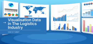
LogisticsManager.com takes a look at why data visualisation is so effective in logistics.
Data visualisation is all psychological. Seeing data in the tangible form of a chart or graph is the fastest way to analyse data at a glance. Visual data is designed to tell a story. It sounds simplistic, but the most significant benefit of using data visualisation is the brain’s capability to process large and complex information in a much shorter period, with the convenience of viewing it on just about any device.
Pre-attentive and attentive processing
Pre-attentive processing is your brain’s ability to subconsciously collect information from your surroundings and filter what is important or what stands out. Data visualisation makes the job of pre-attentive processing easier on the brain, maximising its function.
Attentive processing requires far more work on the brain’s behalf to focus and concentrate. For example, using a spreadsheet to present your data would require some serious, attentive processing!
It is no surprise that data visualisation is so effective in an industry like logistics, but let’s look further into how it can be used for data analytics.

How data visualisation improves KPI reporting and monitoring
Key Performance Indicators (KPIs) are the foundation of business intelligence and data analytics. They are the most reliable indicator of business success. If your KPIs are on the right path, your business will be too. In conjunction with the use of GPUs (Graphics Processing Units), companies can accurately identify KPIs and make better use of them.

Data visualisation enhances your ability to monitor performance for many reasons. First and foremost, it saves time, and time is money. Any tool that helps to make reporting easier is a great thing. It also provides the capability to report instantly. It is readily available to stakeholders on-the-go. It is also accessible from multiple device, turns your data analytics into useful information, and it bridges the gap between having information and knowing what to do with it!
Knowing what metrics to focus on is vital in the data visualisation process. The current movement of logistics companies using powerful GPUs is allowing for highly accurate and crucial metrics to be used:
- Shipping and delivery Times;
- Order accuracy;
- Transportation and warehousing costs;
- Warehouse capacity;
- Number of shipments;
- Inventory accuracy and turnover;
- Inventory-to-sales ratio;
- Percentage of damaged goods;
- Driver safety and incident metrics.
GPUs allow companies to store and analyse larger volumes of data than ever before. Cloud-based GPUs are becoming commonplace in the logistics industry worldwide.
Common uses for visualisation data in logistics
Basic route maps: In logistics, a particular route will need to be completed. The main challenge in logistics is often how to make that route as efficient as it can possibly be.
Tasks, such as pickup and delivery operations and waste collection, can be optimised by using visual data route maps. Route maps are designed to optimise logistical routes, so companies spend a shorter time driving and more time performing the required task. Time, fuel and money are saved using this valuable tool.

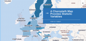
Choropleth maps: A choropleth map provides statistical variables. These maps offer an easy solution to presenting how a measurement varies across a geographic area – for example, the percentage of goods sold per country, as shown above. When a particular country has a greater ratio of goods sold versus what is in stock, the colour is a darker blue. When a country has no sales, the colour is white. A country with a lower number of sales will be a light shade of blue.
In just a few seconds, anyone can view in which countries you are doing well and in which countries you might have to put a little extra effort in.
Optimise carriers’ profits and yours: Data trends can be hard to identify in plain numbers, so data visualisation is beneficial for complex but substantial ROI programs. Programs that often reveal optimisation opportunities include:
- Advance notice of shipping and making facilities open 24/7, allowing carriers to enhance schedules;
- Decreasing less-than-truckload (LTL) shipments and increasing backhauls in order to help carriers get the most out of their miles. This will reduce dunnage and maximise load space;
- Off-peak shipping in the middle of the week, enabling carriers the opportunity to offer lower rates.
Shippers can use visualisation to indicate how optimised cargo space can save money on deliveries in the long term. They can also demonstrate that allowing carriers to optimise schedules this way can save travel time. They can then create data visualisations for internal use that present how carriers’ raise profit while increasing their own.
The logistics industry is transforming with the use of GPU and data visualisation techniques. This winning combination is changing the logistics landscape.
LogisticsManager.com would like to acknowledge the input of Brytlyt for the production of this article


